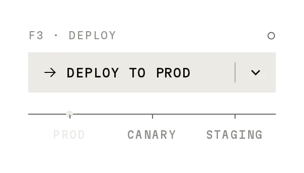
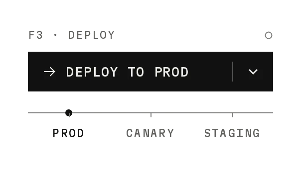
Hold to Confirm
Prov1.0.0Press and hold to confirm a risky change, with a restore option after it lands.
The help line gives the reason.
Build for your project
Code/install build
Usage
Import it and pass your content. The props that matter most are listed next.
Example
"use client";

import { HoldToConfirm } from "@/components/ui/notchset/hold-to-confirm";

export function RollbackControl({ rollback, restore }: { rollback: () => void; restore: () => void }) {
  return <HoldToConfirm onConfirm={rollback} onUndo={restore} />;
}
Props
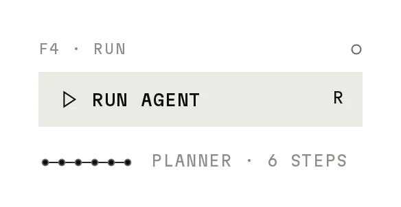
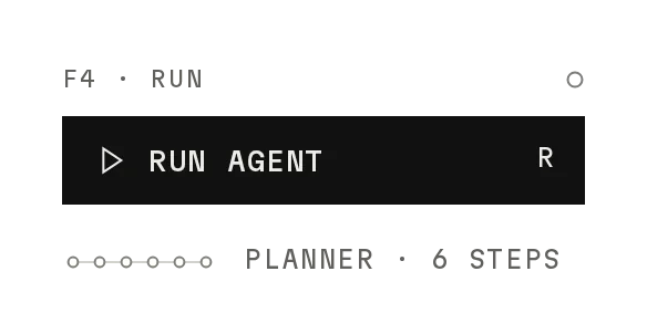
duration / steps–numberThe hold (1400ms) and the nodes on the trace (12).
onConfirm / onUndo–() => voidWhen the hold lands; when Restore is pressed.
undoWindow–numberHow long Restore is offered (5000ms), one dot a second.
labels–Partial<HoldLabels>Kicker, statuses, unit, regions, from/to, key labels and help lines.
disabled / disabledReason–boolean / stringThe reason shows in the help line.
Anatomy
- No primitive needed: one file serves both builds.
- Progress runs on requestAnimationFrame from performance.now().
- Every label is a prop; the defaults are the designed rollback.
HoldToConfirmdata-slot="hold-to-confirm-card"The card.
keydata-slot="hold-to-confirm"The hold key.
Source
components/ui/notchset/hold-to-confirm.tsx
This component is included with Pro.
Try the live preview above. Get Pro to install the source.
Build for your project
Code/install build
Installation
pnpm dlx shadcn@latest add @notchset-pro/hold-to-confirmNeeds your registry key. Your components.json style picks the Base UI or Radix build: radix-*, new-york and default get Radix, base-* gets Base UI.
Styles didn't apply?
The CLI adds the styles to the CSS file named in components.json (tailwind.css). Check that it points at your global stylesheet, that the project uses Tailwind CSS v4, and that the file is imported in your root layout. Installed by hand: paste styles.css into that file.
For coding agents
Give your coding assistant the Markdown guide instead of screenshots.
Use it for
- Consequential changes that roll out in steps: rollbacks, region moves, bulk changes
Use something else when
- Everyday actions: use Button
- Choices that need reading first: use Dialog
Mistakes to avoid
- Make onConfirm idempotent: the hold can be confirmed again after Restore
Agents find it by
- hold to confirm, press and hold, rollback, deploy confirm, dangerous action, Notchset
Where agents read it
- Guide for this component: https://notchset.dev/md/hold-to-confirm.md
- Every component, for tools without MCP: /llms.txt
- MCP server:
https://notchset.dev/api/mcp(setup)
Behaviour
Keyboard
- Hold Space / Enter
- Confirm
- Release / Esc
- Cancel
Accessibility
- A real button: Space or Enter held confirms, release or Esc cancels
- The help line is polite live text: how to hold, how to cancel, how long Restore lasts
- Long-press doesn't open the context menu on touch
Motion
- Hold
- Nodes light in turn (300ms pop), a signal run follows; the key sinks 1px and counts down
- Let go early
- Nodes drain right to left (220ms, 12ms apart)
- Restore
- Five dots empty, one a second
Responsive
- 380px card that shrinks with its container; the trace scales with it.
- The key is 44px on touch screens, and long-press doesn't open the context menu.
Performance
- The hold runs one requestAnimationFrame loop only while held; idle and done do no work.
- Nodes light with CSS transitions on r.
Changelog
v1.0.0 · 2026-10-02
First release
Part of
Included with Pro
Pro is in early access.