CHARTS
Charts, by question.
Notchset charts read like instrument traces: ink on ruled paper, with the one signal colour kept for what needs attention. Grouped by the question they answer, so you pick by what you need to show.
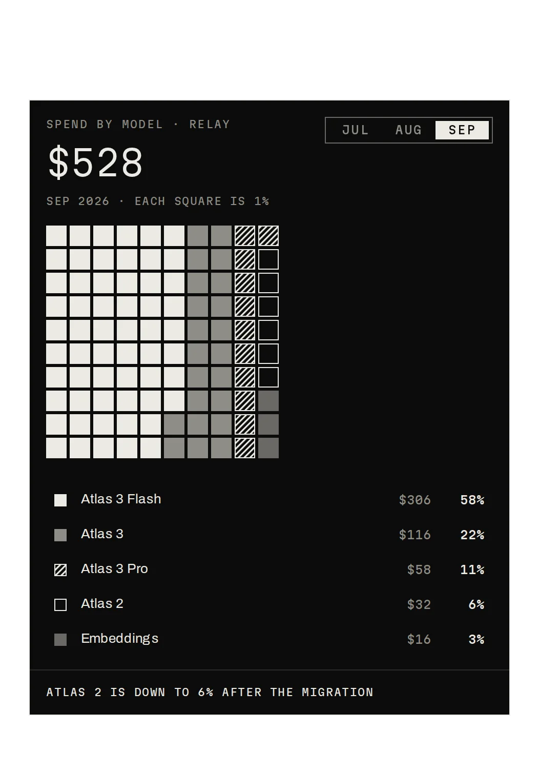
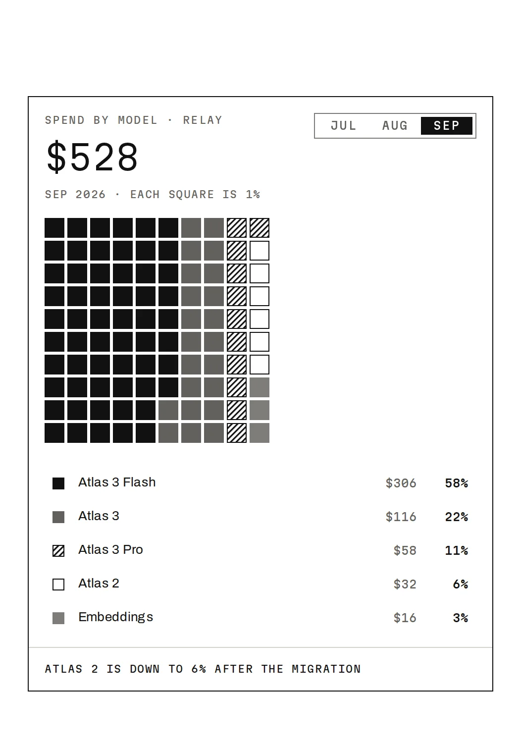
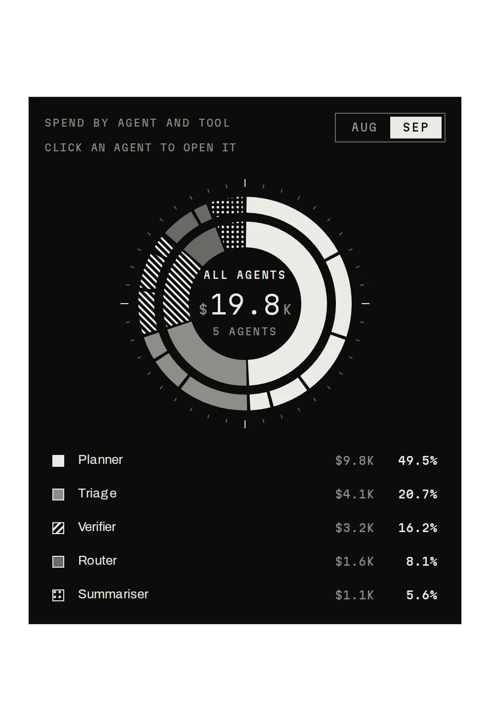
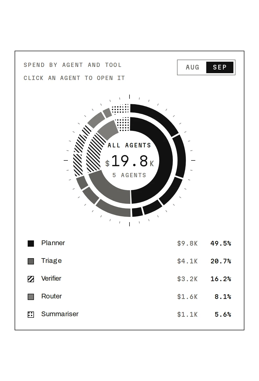
01 · Part-to-whole
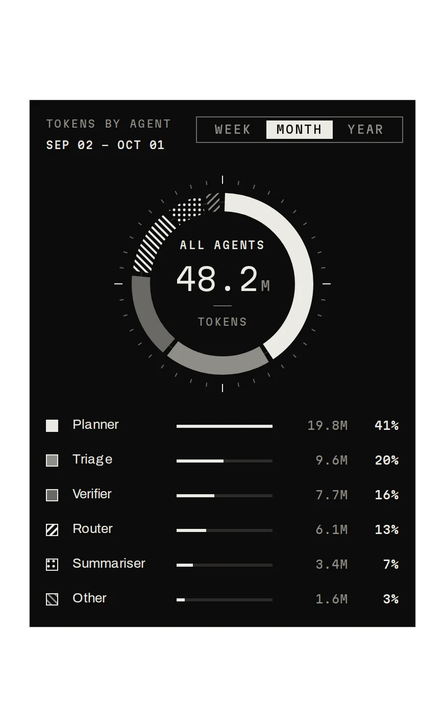
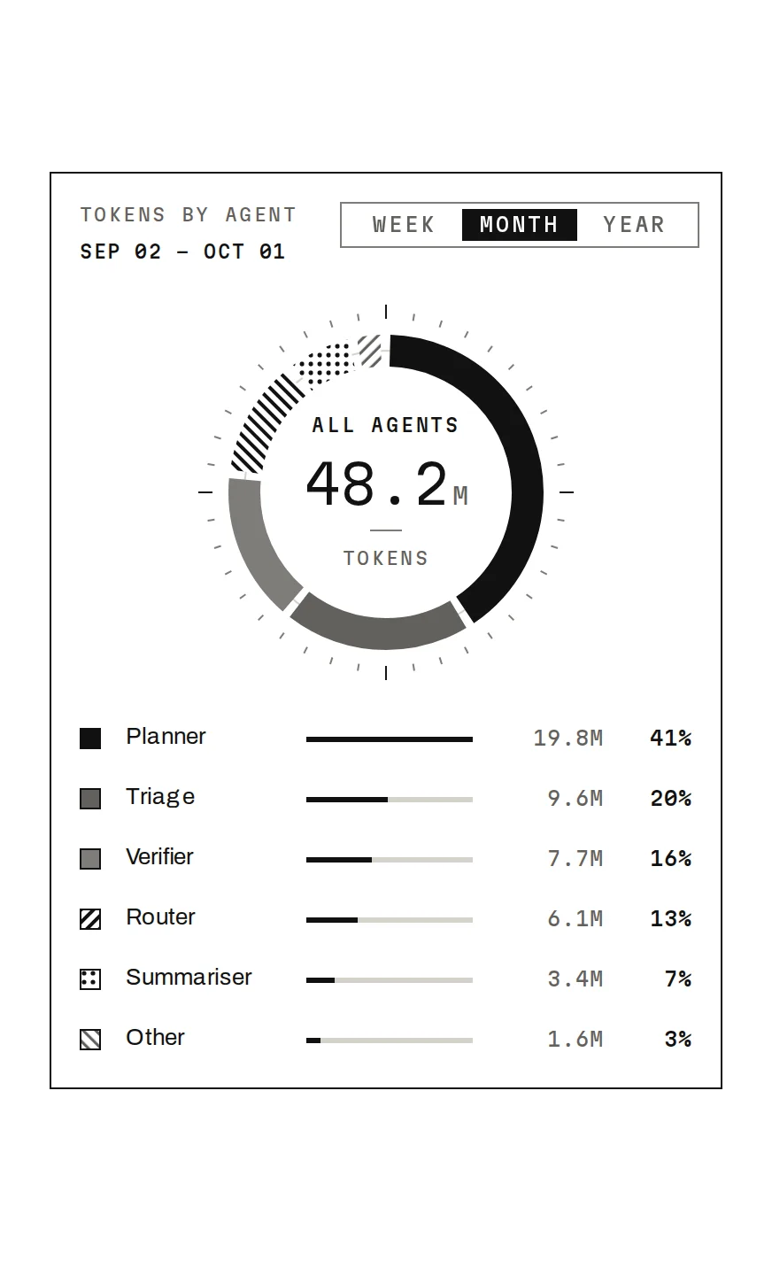
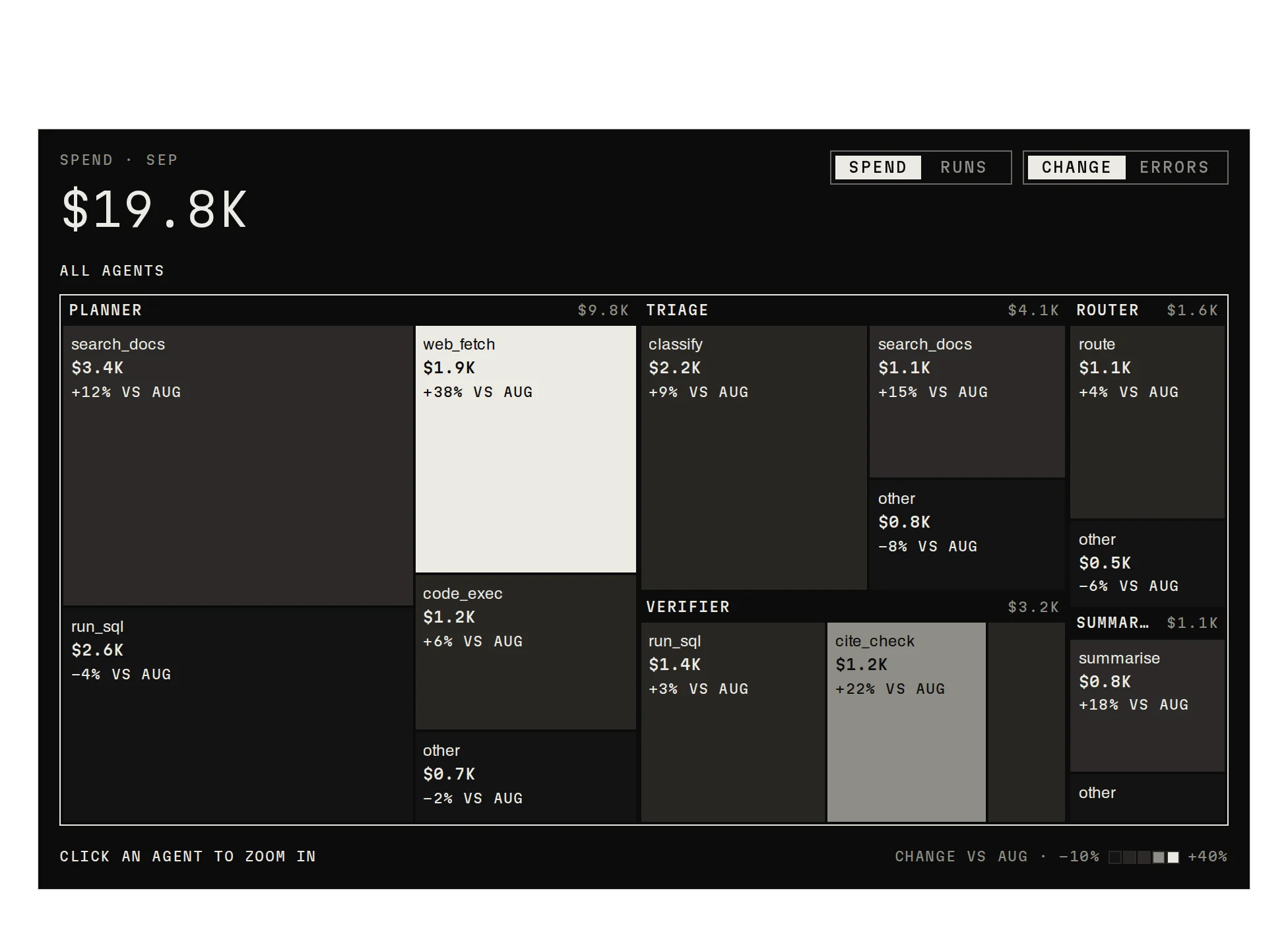
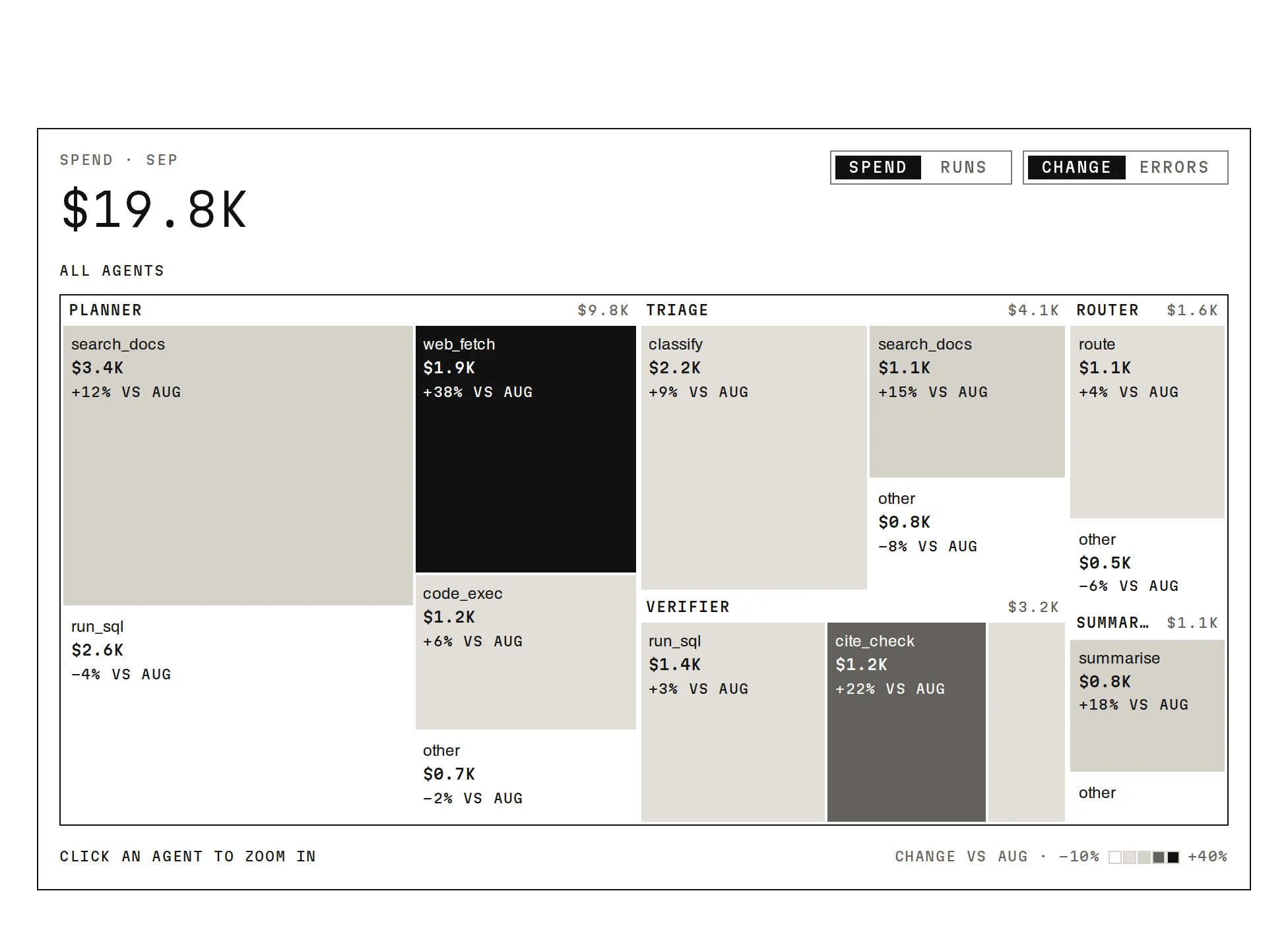
How is the total split?
Where the tokens and the spend go, by agent and then by tool.
02 · Flow and funnel
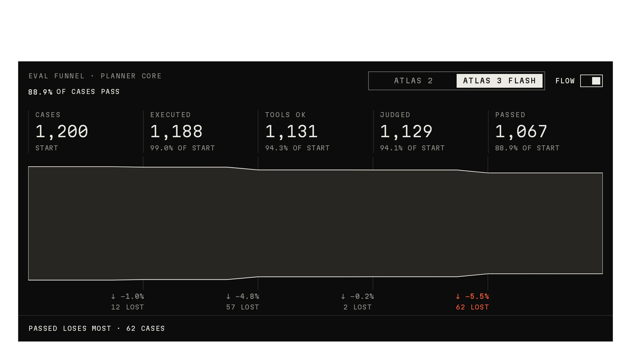
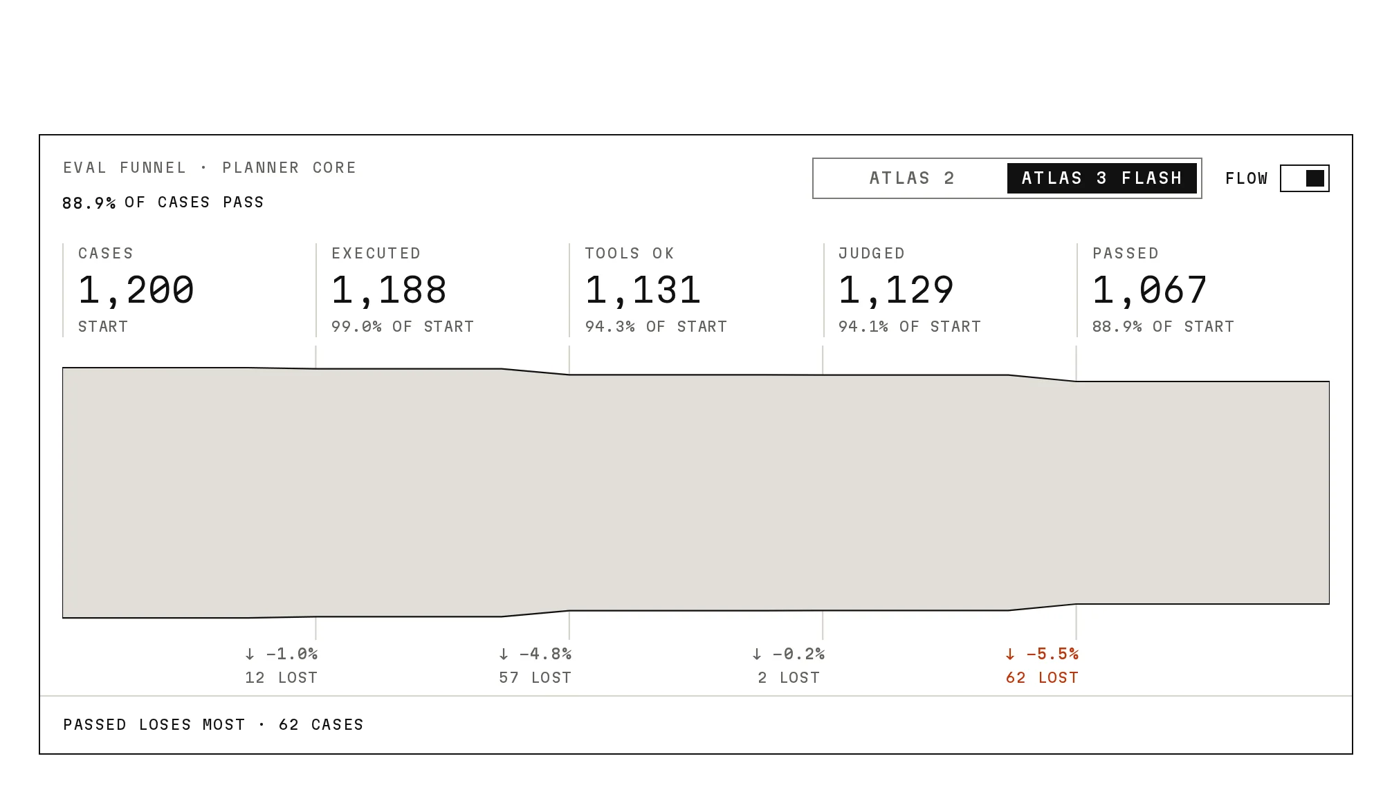
Where do people drop off?
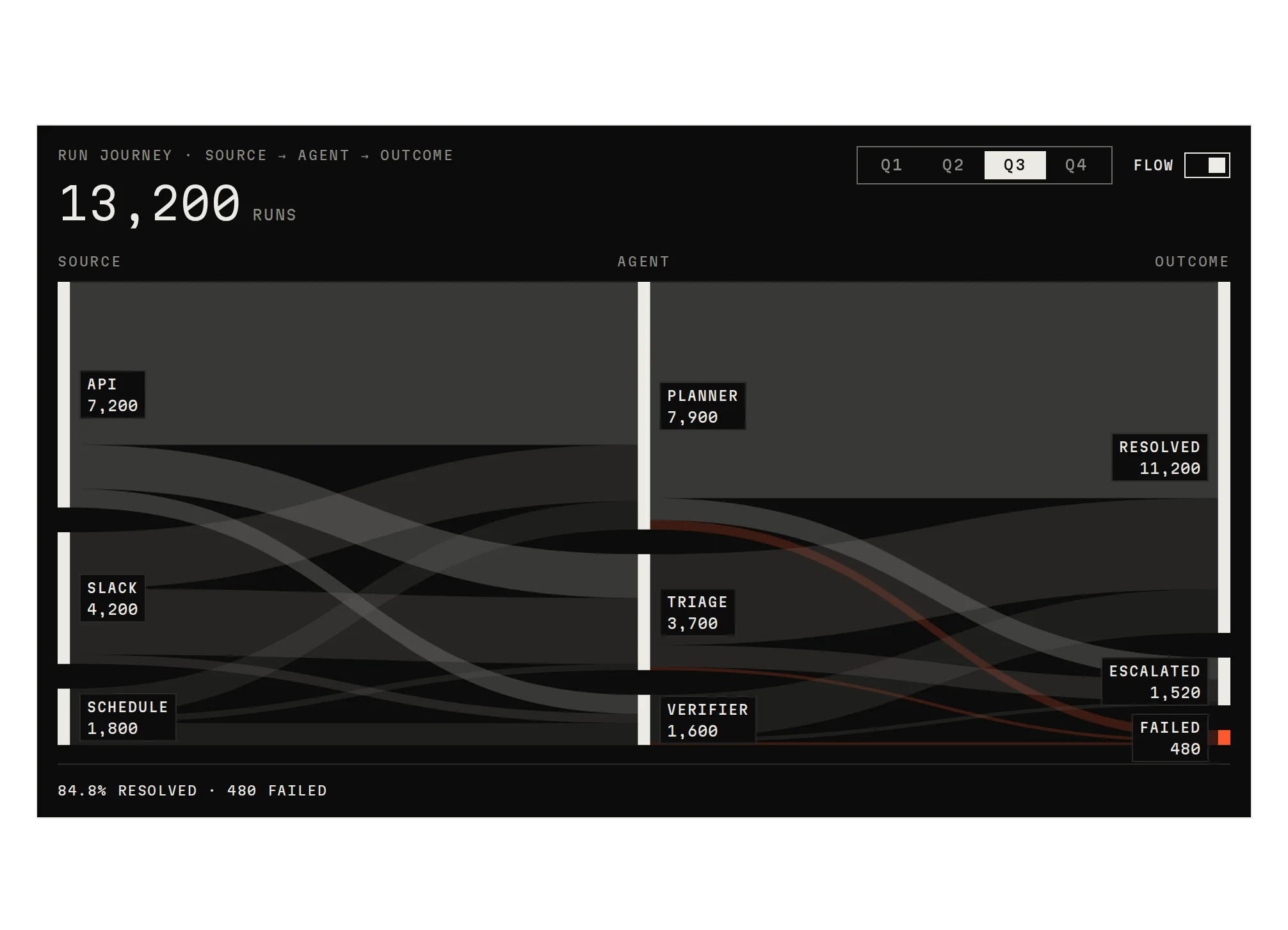
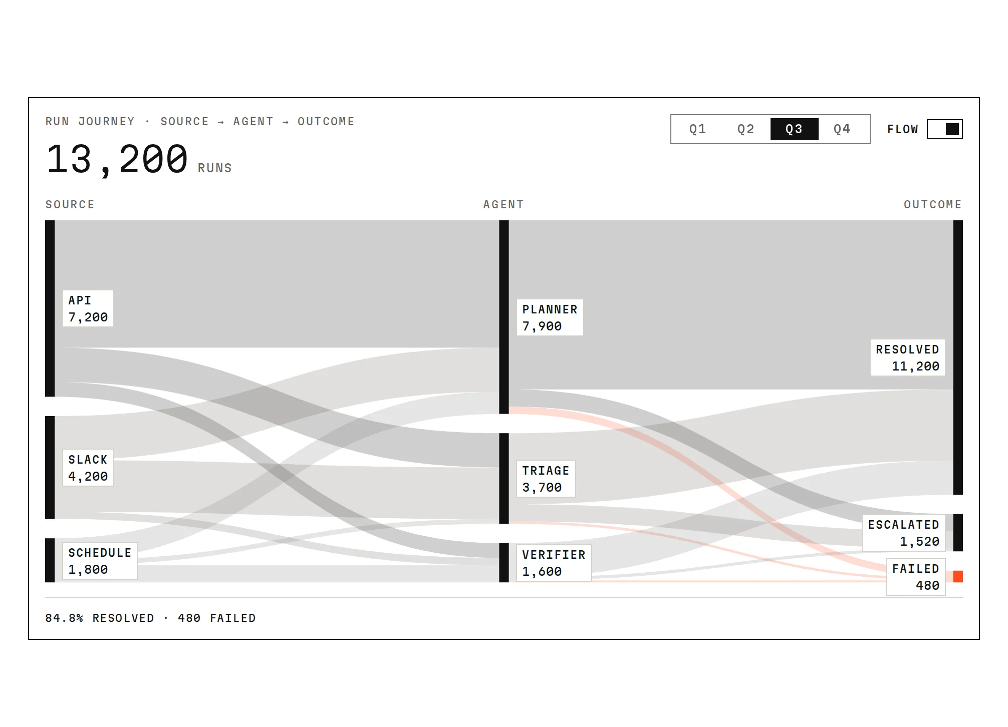
Where eval cases fall out, step by step, and how runs travel from source to outcome.
03 · Coverage over time
How many hit the target?
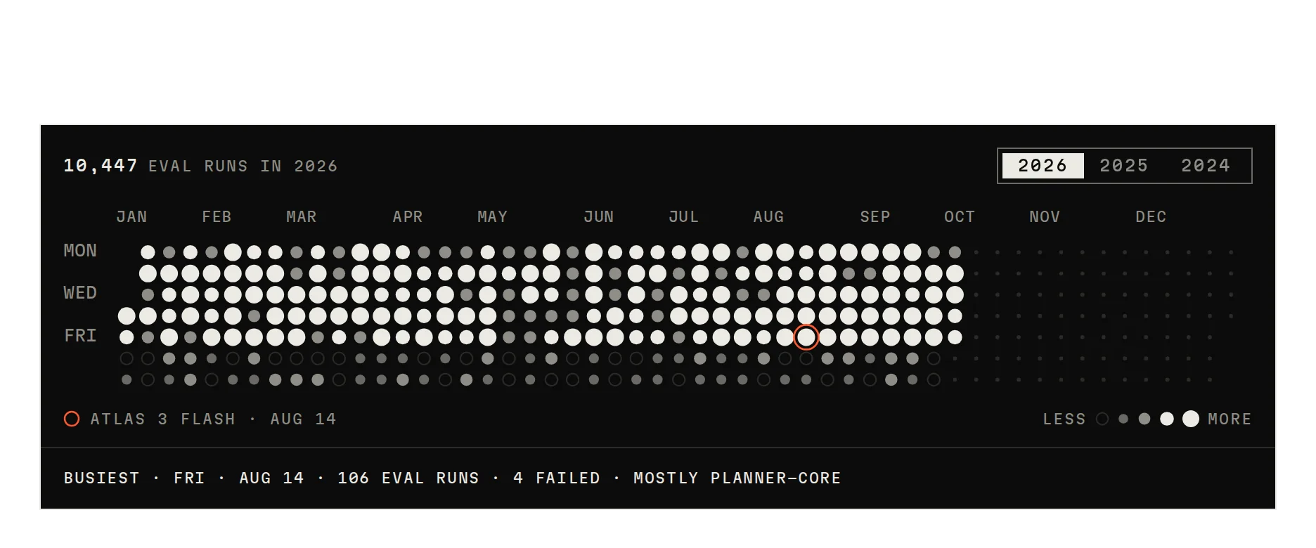
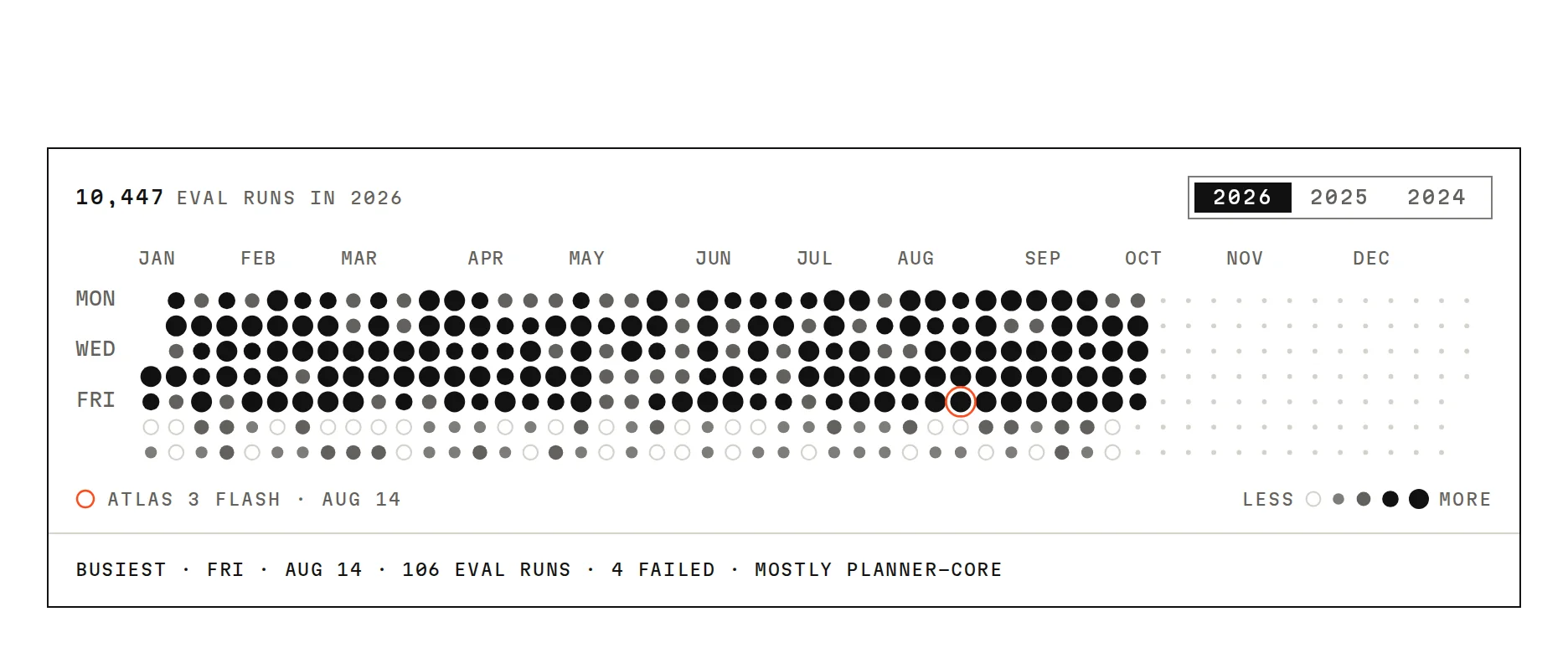
A year of runs, one cell a day.
- DocsPro, with your registry key:
npx shadcn@latest add @notchset-pro/activity-heatmapPro, with your registry key
04 · Distribution and cohort
Which group is different?
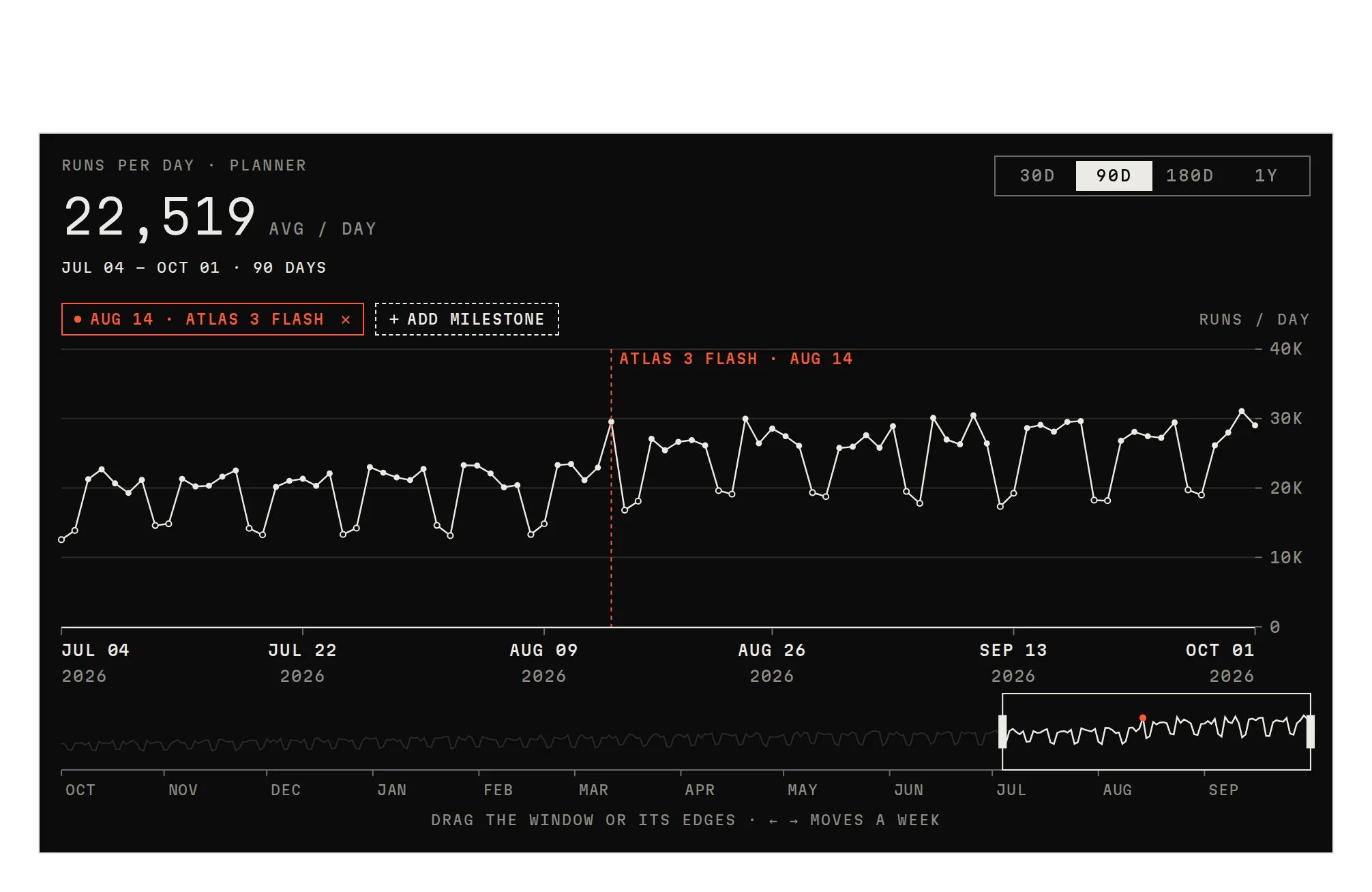
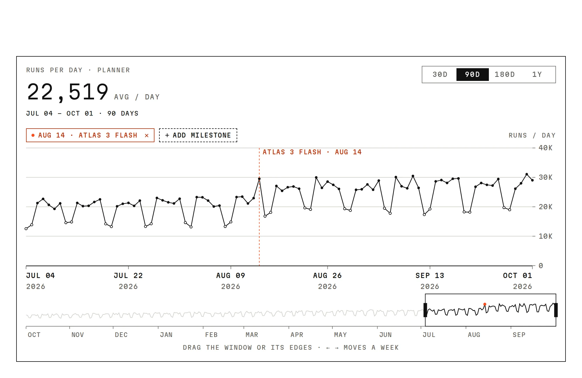
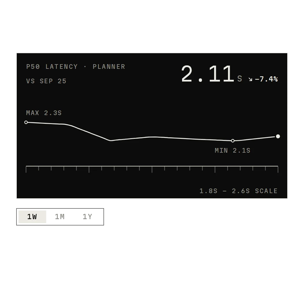
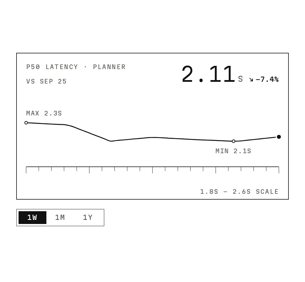
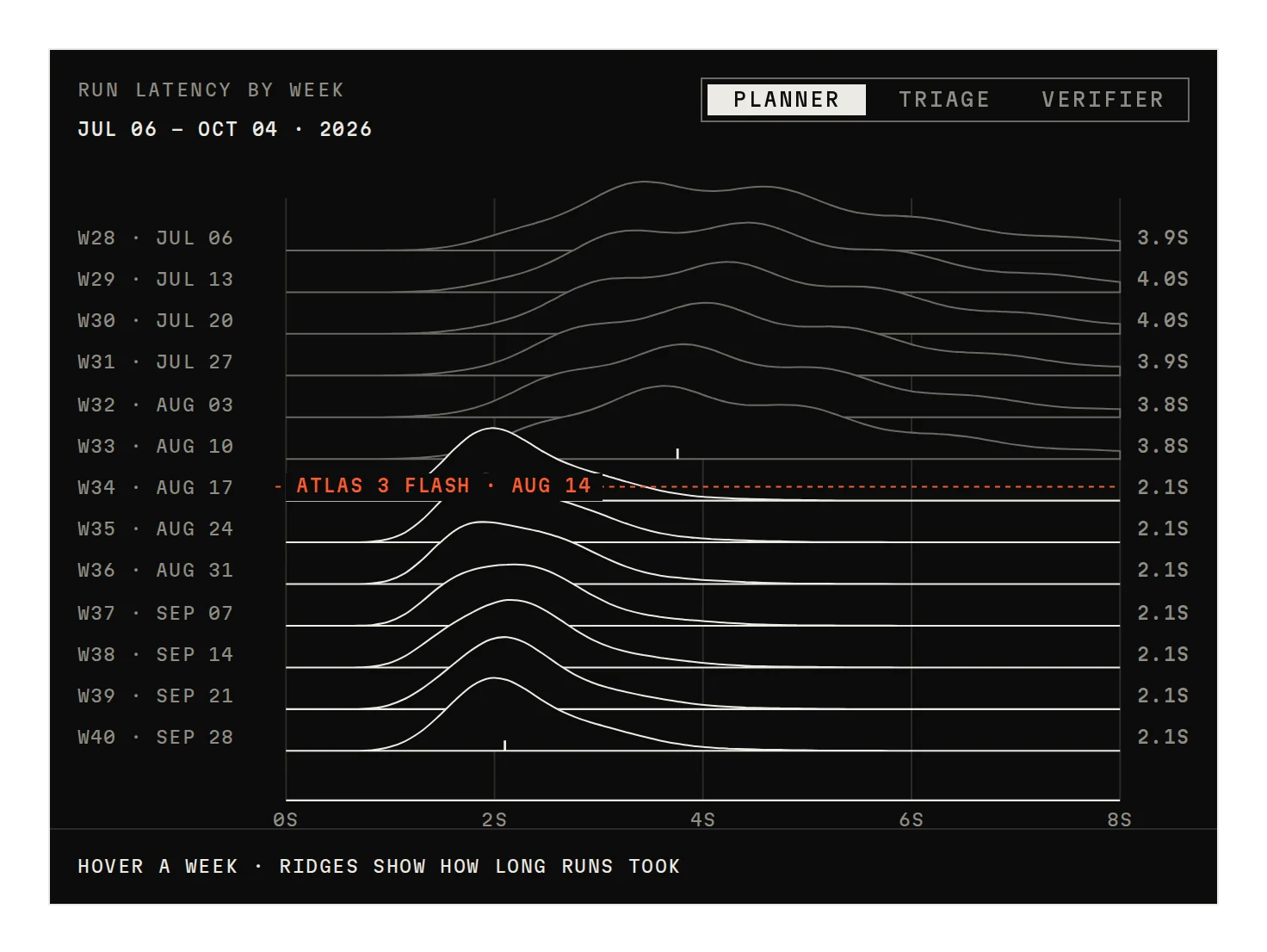
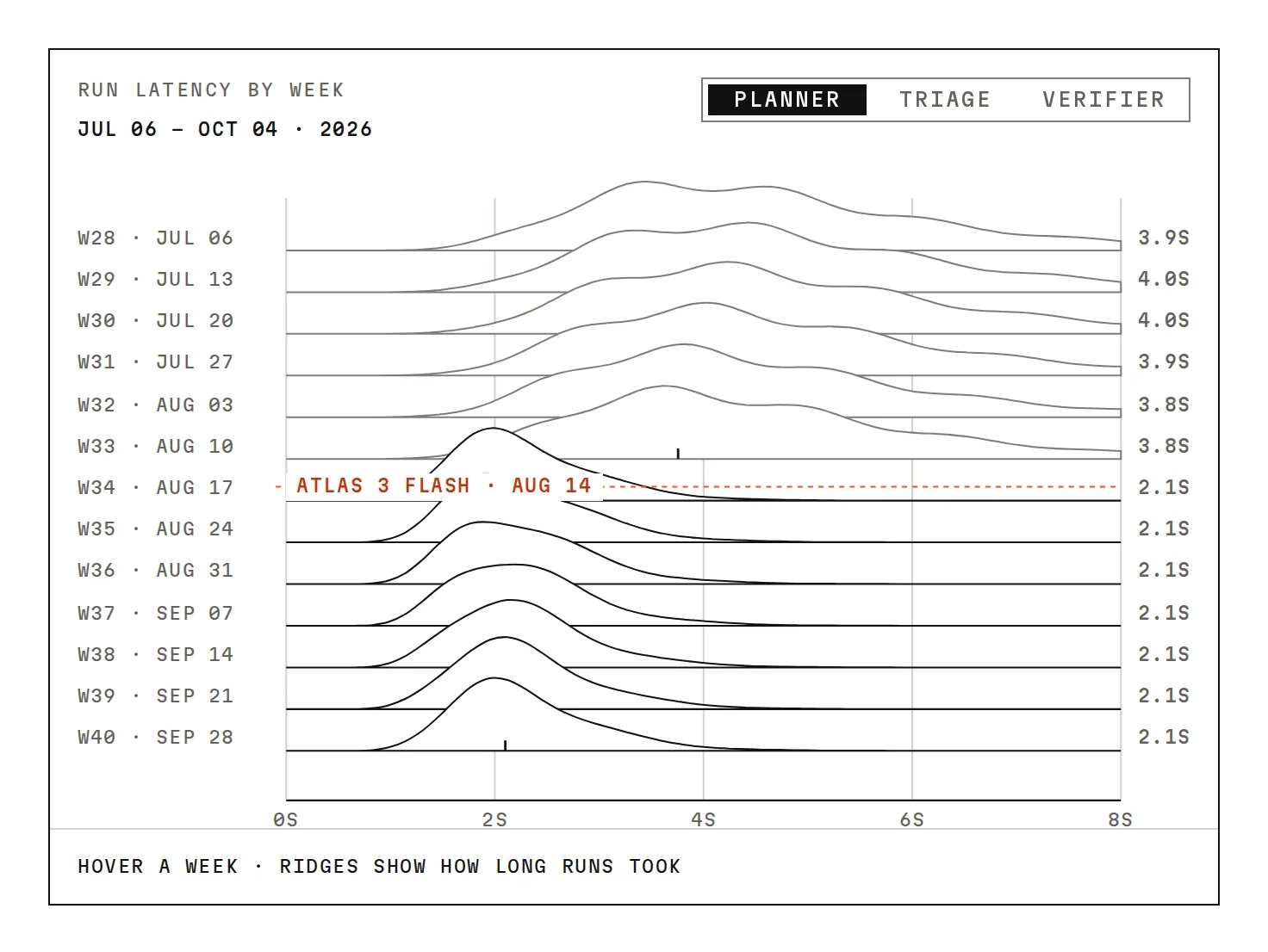
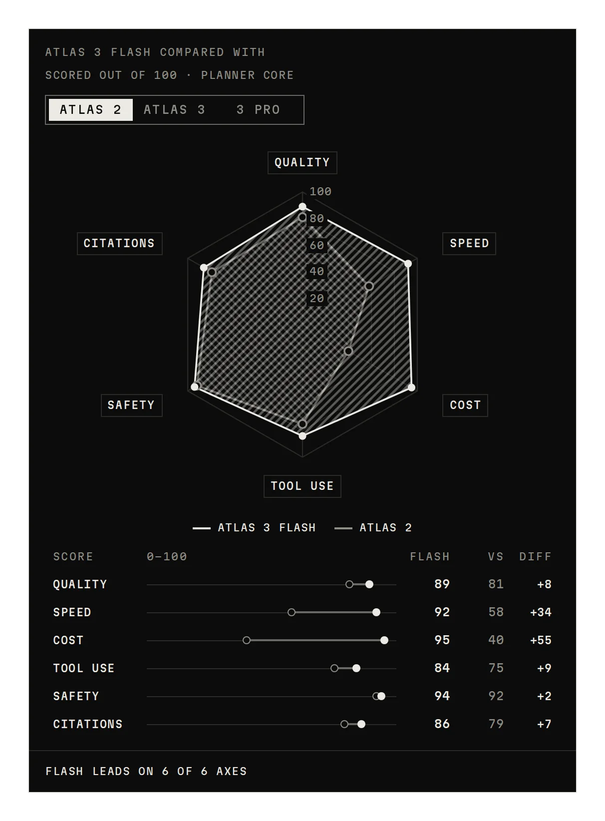
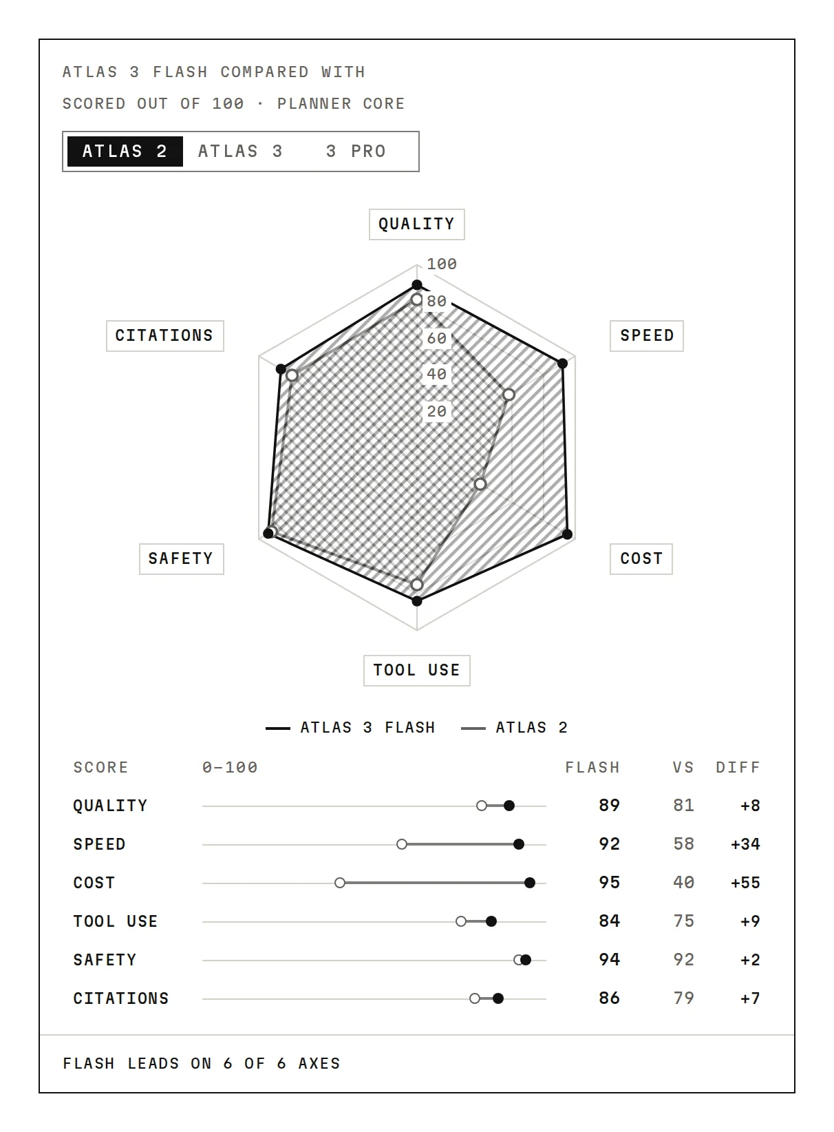
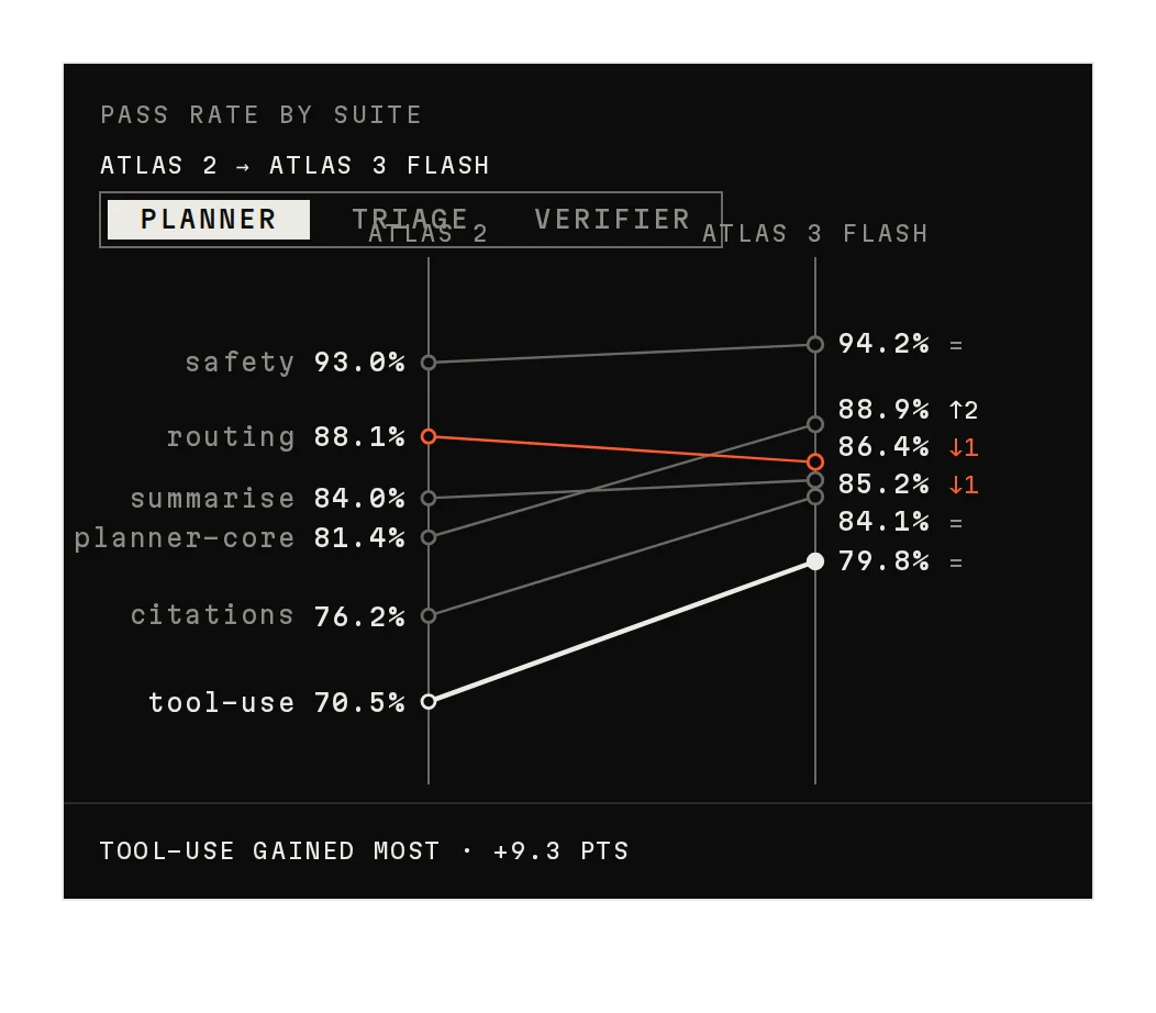
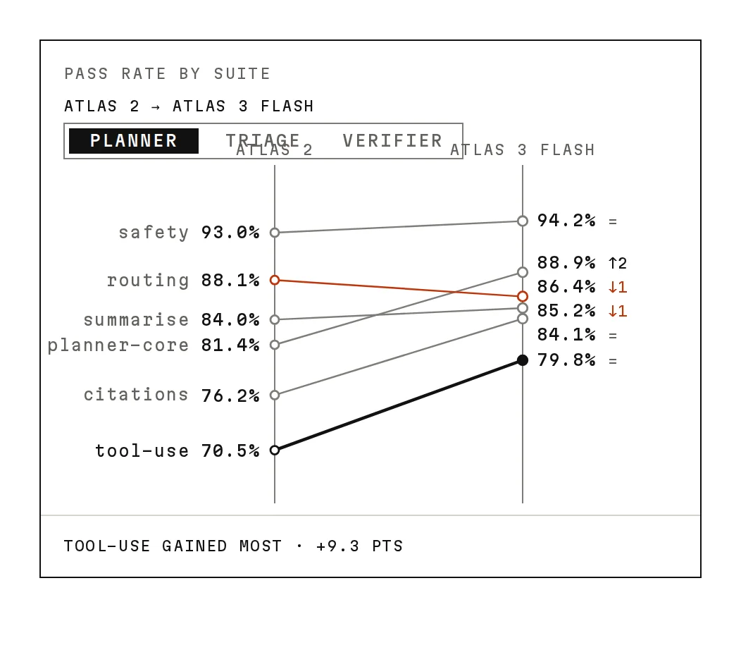
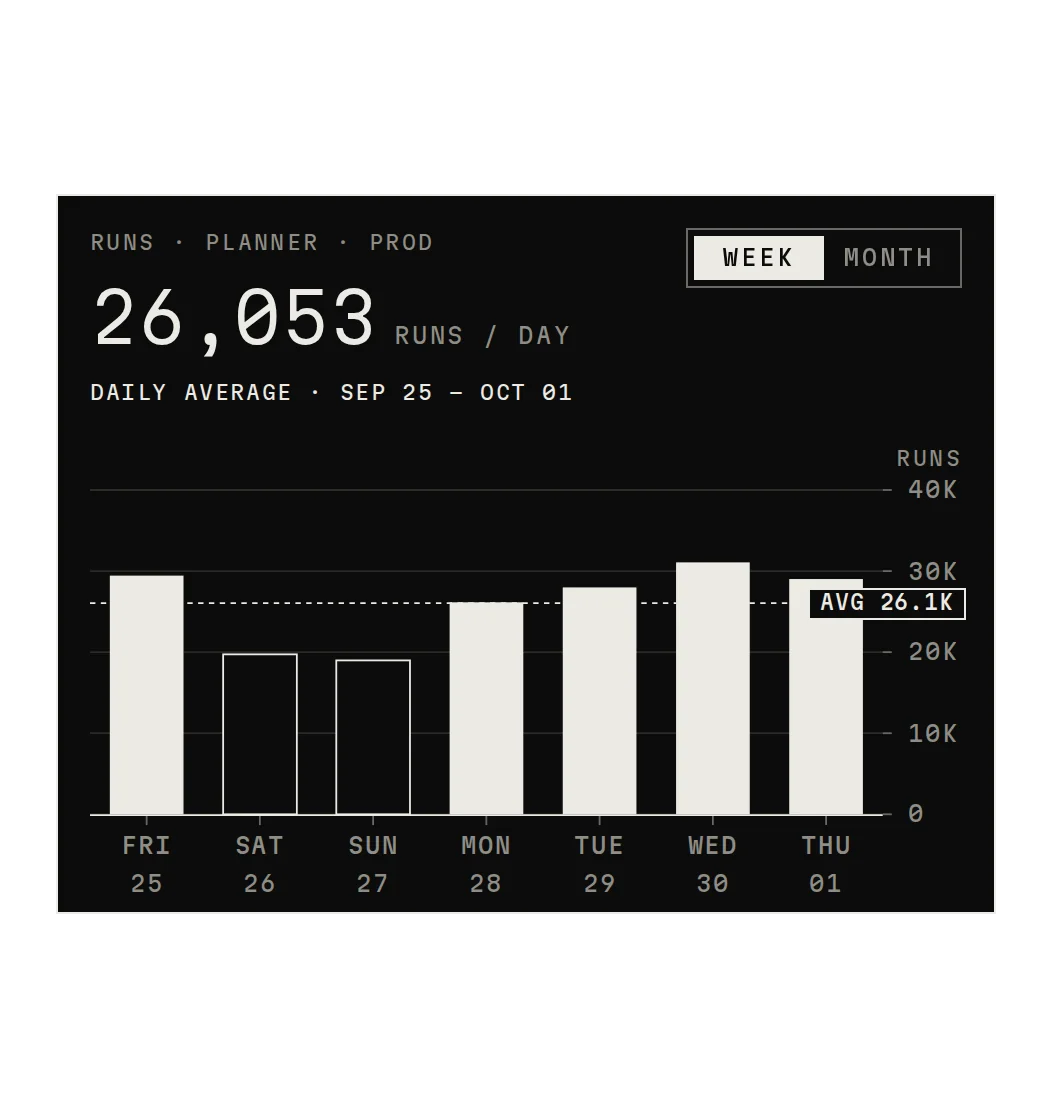
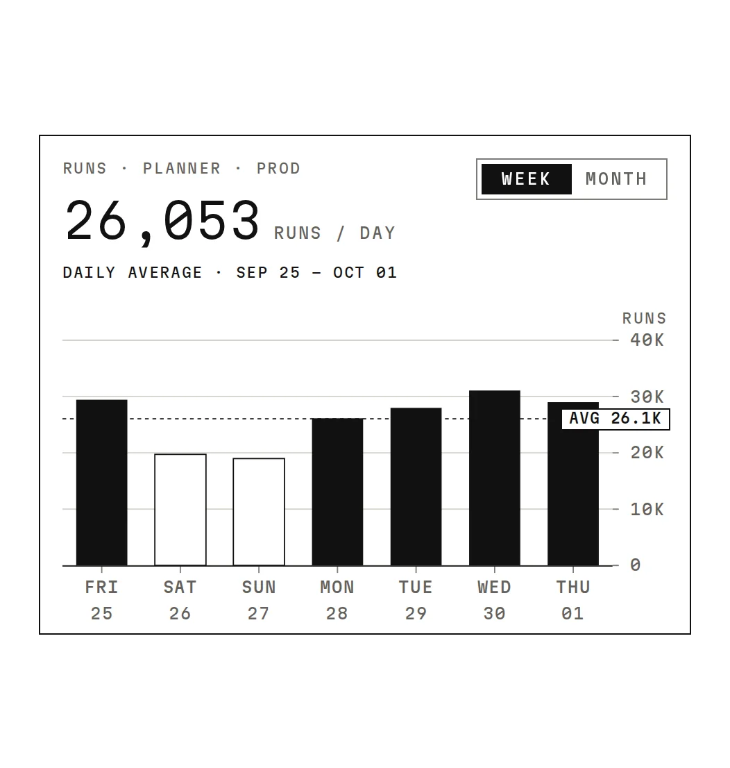
Latency by week, models across six scores, suites that rose or slipped, runs per day.
05 · Progress
Are we closing the goal?
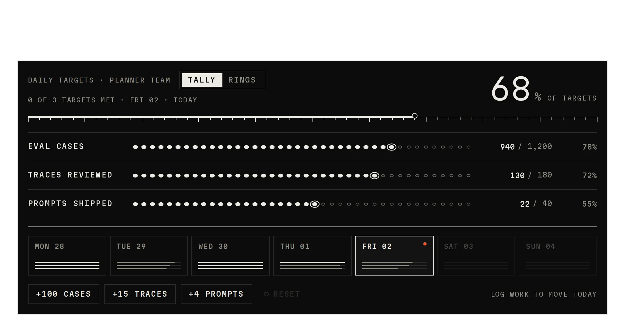
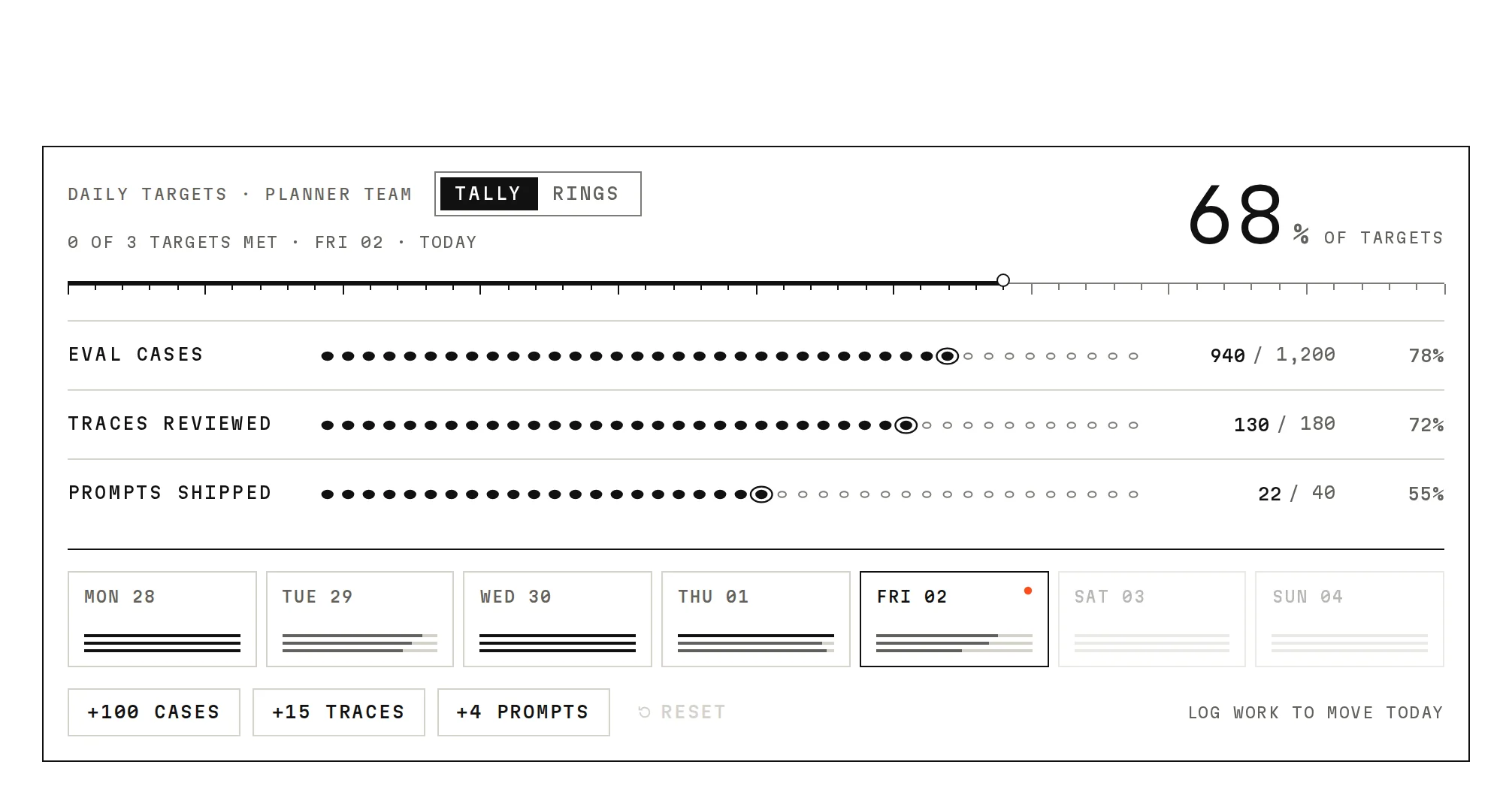
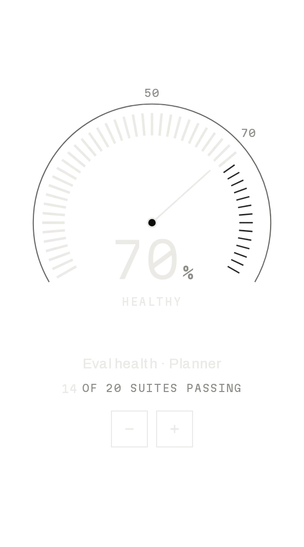
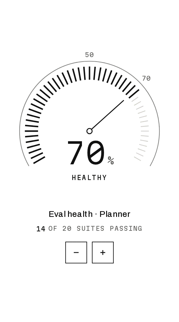
Today's targets, logged as you go, and one health score, zoned.
- DocsPro, with your registry key:
npx shadcn@latest add @notchset-pro/target-tallyPro, with your registry key
06 · Trend
What changed over time?
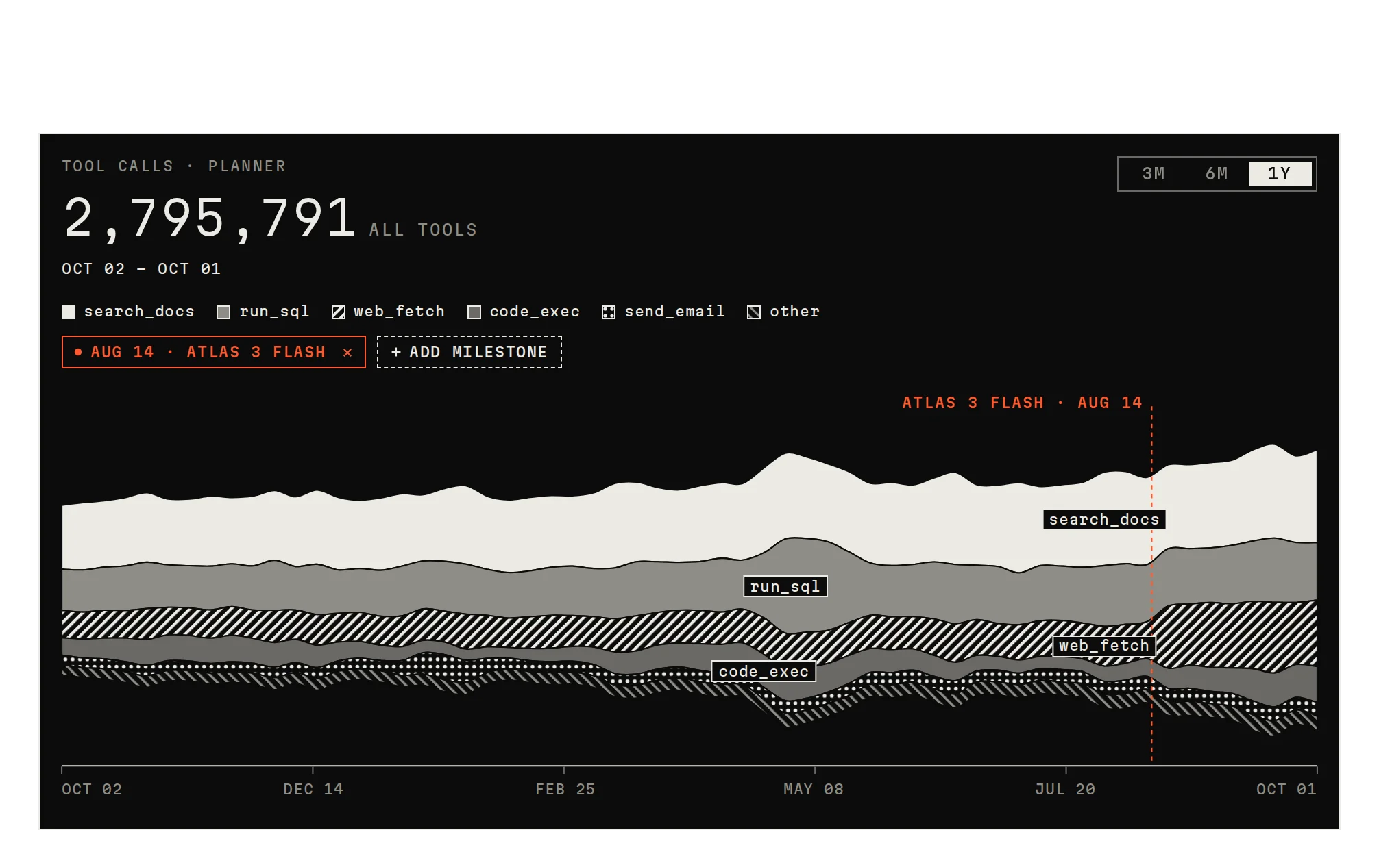
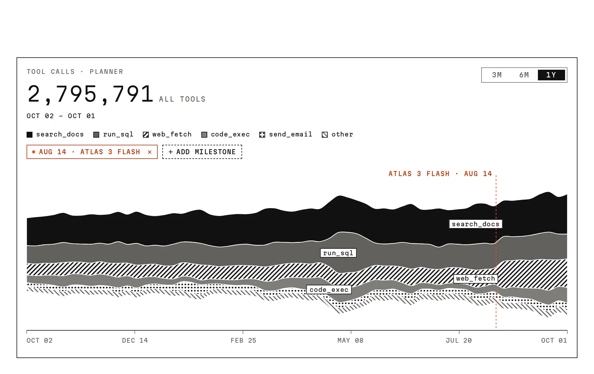
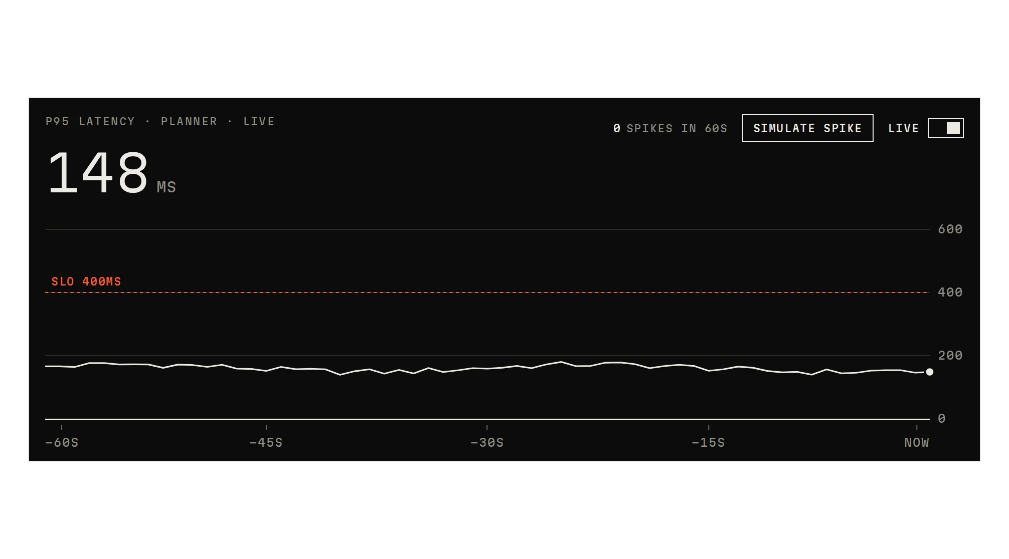
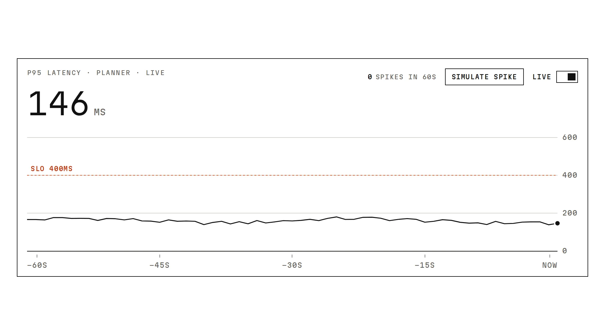
A long history framed to a window, tool calls layered over a year, latency live with spikes called out.